Summer Time Hustle

Greetings Friends. 

My blog has been falling to the back burner once again, but that is due to the lack of hours in a day and my need for a good nights rest. But luckily for all of my loyal readers (hi Dad!) I have a doozy of a post of all of the fun projects I have been working away on. Here we go!

The Creative Collective is over 200 members now! All of our events have been overwhelmingly well attended. Our next event which will be a fun/social event is going to be a Lazoom Tour. It is turning into a really positive thing that is genuinely helping the creative class here. I think changing the mindset from competition to collaboration is a big part of the emerging economy. I just don't think so, this article human to human agrees. I also too was part in a Business Advisory Council event as a panel member. The event's theme was focusing on the power of networking where I also touched on the Creative Collective. YAY! 

In my last post, I mentioned that I had been doing more web work. It is not my favorite thing to do, but people need and will pay for it. Guess what; I can do it! The following site was my first wordpress site build. I may or may not have been found crying at my desk in frustration, after breaking the site right before uploading to the server for the client. But live and learn people, I thankfully was able to get it working again thanks to my handy time machine. Thanks Apple, Harry helped to. More and more people are wanting Content Management Systems (CMS) for their websites which is basically an interface that allows publishing, editing, and modifying content from a central interface. I call it a WYSIWYG (what you see is what you get) editor for people who don't know coding languages. If you can use a computer, you can use a CMS platform to manage your website, and maybe Wordpress or Squarespace is the way to go. 

My fellow Creative Collective member Hank Eder, who does PR and Marketing, asked me if I would like to bid on doing a website for Veazey Insurance that he was bidding content writing for. I was weary just because learning curves can be a bitch, but sent off a quote and we got the job. So, I dove in and learned Wordpress, it took me longer then I thought but after tears and frustration, we ended up with a happy client. I now had the added skill set of Wordpress, boom! Check out Veazey Insurance Agency's site to see how it turned out. I have attached a couple screen shots for your viewing pleasure.


A fellow PNG friend Debbie Francis was a Realtor under Keller Williams and decided to make the move to independent. Once you go independent, all the pre-designed business cards and signs that you get being under a company like Keller Williams goes away. She asked me to help brand her new business, Asheville Area Realty. Being new to the area, I had to start with a lot of research as to the different realtors in town as well as houses on the market. Let me tell you, there are some amazing houses here. Hopefully in the next year or two I will be in one; renting is wearing on my soul. But back to the branding. When starting from scratch, first thing is first the logo. After the logo, everything starts to fall into place. We went through many renditions before settling on the following. I really wanted to represent why people want to buy a house here so the house is represented because that is what people are ultimately coming to her for and then the majestic mountains and the sunshine. Professional, sophisticated, and Asheville. 


Her business card was next and I feel especially with all the networking we both do she had a to have a business card that really had wow factor. What has more wow factor then gold foil. I love how they turned out.


After the business card we modeled the rack card and we needed a really great photo of the mountains. I went to another friend and Creative Collective Member David Simchock and he is a very talented photographer with tons of photos of the Asheville Area and I found a really great photo of the mountains that worked perfectly on the rack card. 


Finally, what does every Realtor need but yard signs. Keeping everything cohesive and branded, I did the yard signs that of course coincides from what we started with on the logo. These are the designs; hopefully when they are up I will get around to photographing them in their natural habitat. 


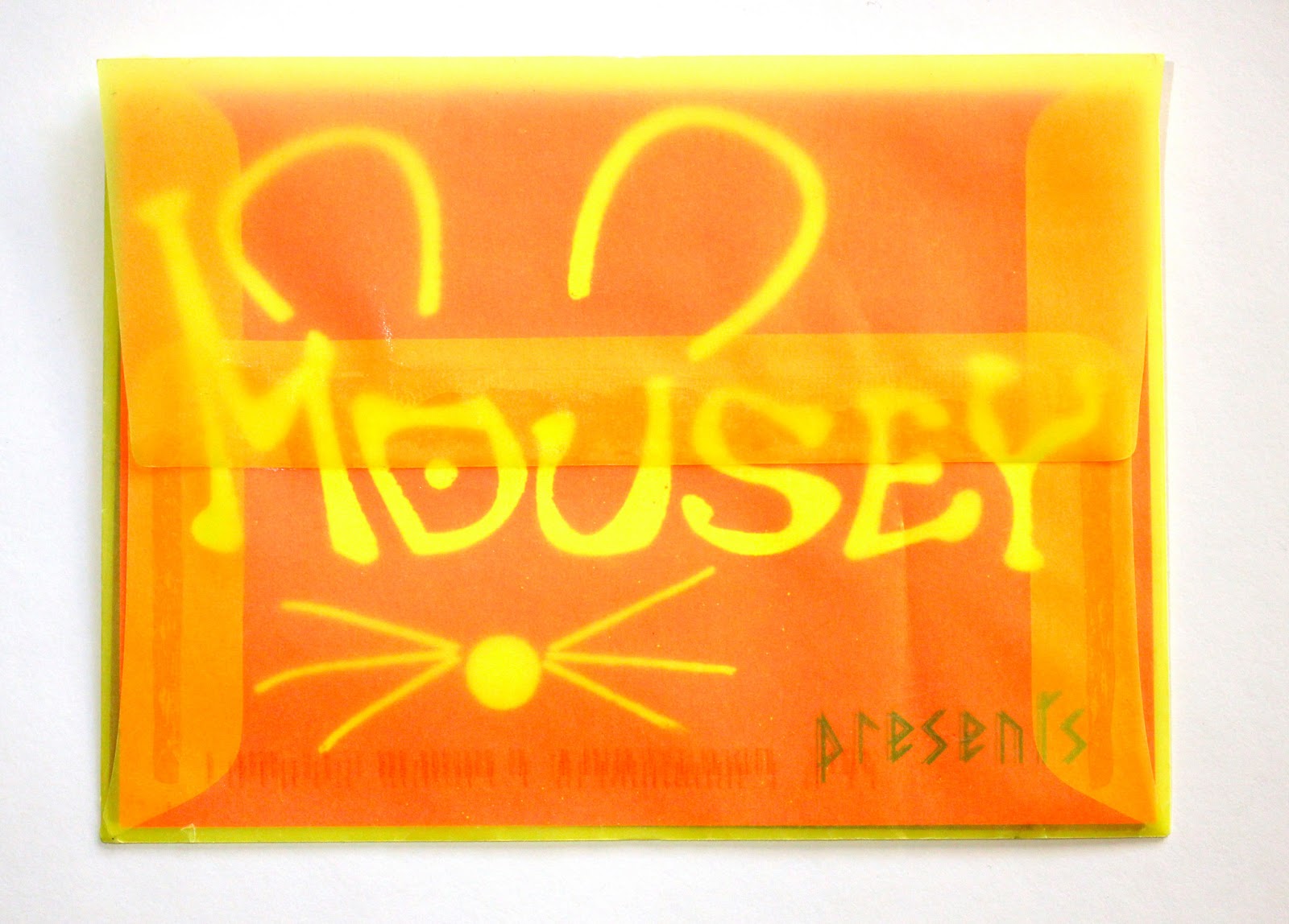
Not all my projects are as intensive as the previous some are just a simple ad or flyer. A good ad is proven to be more effective than one put together by someone without experience in layout and typography. If you are spending money on advertising spend the extra money on a designer to make an ad the speaks meaningfully to your customers. Here is one I did for Renaissance Moccasins.


I am currently finishing up her website which I should have up hopefully by the end of this week, fingers crossed! With a new logo planned for this fall. 


Also another quick project I did was for a new company, the Holistic VA Network. It is an online platform connecting holistic entrepreneurs with talented, caring, virtual assistants and freelancers. They are getting ready to launch this summer, and wanted flyers to give out at one of the biggest conventions for holistic entrepreneurs that the founder Shannon Lagasse was attending. I really enjoyed how they turned out. I hope to be helping them more in the future!


Lots of other exciting things on the horizon. I have been upping my game and trying to always learn something new. I have been watching a lot of Creative Live courses. One on Instagram and I have officially made Lucid Creative Studio accounts separate from my personal accounts. Feel free to follow me @lucidcreative on Instagram and Twitter! 

much love xx
Kiere

The Best Kind of Busy

Greetings Comrades,

So much to discuss, so little time. The Creative Collective is getting very real, very fast. I am excited to announce we have our meetup page up; 104 members and counting in less than 10 days! Very exciting to know I have found something that was greeted with such excitement from the community. I am very excited about what is to come. I am going to do my best to make sure it is a beneficial, positive thing that helps everyone's bottom line. I am very excited about our Forum, which also got a mention in the Citizen Times. Woot Woot!

Since The Creative Collective is getting serious, we obviously needed a serious logo, which I was happy to take care of. I will admit it wasn't my favorite to start. I really did think it was the best solution in the end. It does have abstract representation, the dots being people and the lines being connections of prosperity and collaboration. To top it all off, it looks pretty cool and professional too.
Creatie Collective Asheville Logo
Also, the Carbon Sitars website is up and running which I had a hand in. Check out his custom Suibokuga sitar build; it is amazing to see it come together. It will be completed shortly, and I am excited to hear and see it. In addition, I helped design the Japanese style peg head inlay. After making this website, I have been getting asked more and more to do web work and I am starting to agree to take it on. A paid gig is a paid gig.


Suibokuga Carbon Fiber Sitar

Being a designer, I know that sometimes you are paired with a client that isn't getting exactly what they are looking for. In those situations, sometimes another designer can be brought on to do some extra comps. I have been that designer as of late, and let me tell you, I really enjoyed doing it. Why? Because, it was simple and hassle-free. I got to design my best solution as to what they wanted, send it off, and was done. They wanted an abstract bridge and an arch to represent the following quote made by Martin Luther King Jr:

"The arch of the universe is long but it bends towards justice"

 The following is my solution. I don't know if it will be the chosen design but I had fun doing it.
That is all for now, I hope everyone in the Asheville area stays safe during the snowpocalypse. While everyone else is having a snow day, I will still be working. Ah, the joys of a home office. I hope everyone makes some time to get creative, while enjoying their snow day. 

Much love,
Kiere


New Year, fresh blog.

Greetings Friends!

Things have been trucking along, and I figured it is a new year and that means a new blog... although I had started this blog weeks before the new year. As I previously blogged, I am always working to shorten the time between blogs. I will continue to try and get the time between posts shorter and shorter, but I am happy with my progression. Don't ever turn your nose up at progress.

The Creative Collective has been progressing in such an inspiring and exciting way. I have been so lucky to have seasoned facilitators helping to make the collective a success. So many groups start and pitter out, but we are taking the steps to avoid that outcome. As much as I wanted to implement dynamic governance into the group, I felt (and it was recommended) that it was a little too structured for the CCA. We are still using facilitation methods that work similar to dynamic governance, but without the structure and tedious implementation. We have had a couple core group meetings to iron out a cohesive vision, how we will aim to get to that vision, and the details of how the group will function. It has been great and we are getting very close to having our first "open house" meeting open for all creatives. There is a logo in the works as well as a meet-up group on meetup.com. If you are interested in helping the collective thrive, please feel free to get in touch with me.

Let me just start out by saying infographics are extra hot right now. They are a great way to show information in an engaging creative way. Getting people to read data and information can be a challenge. When the fabulous Sarah Benoit approached me to do one for her I was instantly excited! Sarah Benoit is owner of Creative Original and Director of training at JB media group. The infographic needed to be a blending of those two brands into one informative promotion piece that was ultimately a fun representation of who Sarah is and what she is an expert in. The infographic is primarily going to be used for e-mail marketing, but also will make a cool printed piece as well.
promotional infographic

I enjoyed doing Sarah's infogrphic so much that it was a kick in the butt to actually get started on an infographic for recyclables that I had in the back of my mind since moving here. Being an ultra hip, green town, recycling happens here. When I moved here, I was very excited that there was curbside recycling!!! Needless to say it makes me feel good knowing that I'm not adding to the Pacific garbage patch. However, like most recycling programs, there are many things that aren't accepted for curbside recycling like plastic bags, compact florescent bulbs, and styrofoam, to name a few. So I am in the planning stages to make a full infographic on what is accepted in the curbside pickup, where you can recycle what is not accepted curbside pickup. No one wants Mercury in the water table from wrongly disposed of compact florescent bulbs. More on that in the future.

Another talented lady I know, Cynthia Lindeman, has been updating her blog and working on moving it from wordpress to her own domain. She had asked me to help with design of the site; I was unsure if I wanted to start down the road of webdesign, but I agreed. I can do websites, but often don't since I don't like to code. But she asked for design and her significant other (who is a coding master of sorts) would do the coding. It was a win-win situation, so I agreed. I worked with her to make sure the website reflected what she envisioned for her website and what she brings to the table for creatives. Basically the website is a reflection of her and what she wants to give her followers. Light, hope, inspiration, were just a few of the adjectives I worked off of. I really like what transpired. The website should be up and running in the next couple of weeks!


Until next time!

Kiere

Things a Brewin'!

Many greetings Friends, 

Per my general style, it has been a while since my last blog. I don't consider myself a blogger, which is probably why staying consistent with posts is a challenge for me. I have been a networking fiend as of late, just doing my best to get connected to the community. I have made a lot of friends and great contacts. It is paying off, but just taking longer then I had anticipated. I haven't been just doing networking, but also meeting the movers and shakers in town. While talking with these people they give me great resources, but say it is a cheap town and expect to work for little to nothing. I think it is time for Asheville to change that narrative. 

Being a proactive leader and wanting to prosper here, I want to take charge and help creative professions have a thriving community. That is why I am starting a Creative Collective. The goal of the collective will be to educate the public on creative services and form a community to help one another. When I say creatives, I am referring to designers, musicians, writers, photographers, film makers, artists, ect. The group will be based on the dynamic governance system which operates on 4 principals.


Consent Governs Policy Decision Making

Decisions are made when there are no remaining paramount objections; that is, when there is informed consent from all participants. Objections must be reasoned, argued, and based on the ability of the objector to work productively toward the goals of the organization. All policy decisions are made by consent although the group may, by consent, decide to use another decision-making method. Within these policies, day-to-day operational decisions are normally made in the traditional manner.

Organizing in Circles

The sociocratic organization is composed of a hierarchy of semi-autonomous circles. This hierarchy, however, does not constitute a power structure as autocratic hierarchies do. Each circle has the responsibility to execute, measure, and control its own processes in achieving its goals. It governs a specific domain of responsibility within the policies of the larger organization. Circles are also responsible for their own development and for each member's development. Often called "integral education," the circle and its members are expected to determine what they need to know to remain competitive in their field and to reach the goals of their circle. I see these circles to each be made up of each subsection of creatives. For example, all the photographers would make up a circle and consent to decisions that work for them because we all face different issues but ultimately have the same goal.

Double-Linking

Individuals acting as links function as full members in the decision-making of both their own circles and the next higher circle, the General Management Circle. Operational leaders are selected by the next higher circle and represents the larger organization in the decision-making of the circles they lead. Representatives are selected by the circles to represent the circles' interests in the next higher circle. These links form a feedback loop between circles. At the highest level of the organization, there is a “top circle”, similar to a Board of Directors, that connects the organization to its environment. Typically these members include representatives with expertise in law, government, finance (including investors), community, and the organization's mission. The top circle also includes the CEO and at least one representative of the general management circle. Each of these circle members participate fully in decision-making in the top circle.

Elections by Consent

Individuals are elected to roles and responsibilities in open discussion using the same consent criteria used for other policy decisions. Members of the circle nominate themselves or other members of the circle and present reasons for their choice. After discussion, people can (and often do) change their nominations, and the discussion leader will suggest the election of the person for whom there are the strongest arguments. Circle members may object and there is further discussion. For a role that many people might fill, this discussion may continue for a several rounds. When fewer people are qualified for the task, this process is short. The circle may also decide to choose someone who is not a current member of the circle.

Before any of this happens I need to form the Implementation Circle which will be a cross section of the collective. It initiates the infrastructure for maintaining the governance system: the logbook systems for record keeping, policies for distributing minuets, regular meeting times, training current members of the organization and orientation and training of new people who join. I am currently setting up the first meeting and if you are interested in being part of it get a hold of me.

Ok, on to more design related things. New work coming in has been slow but, I have been designing things, YAY! My partner in life and work has started a new venture, Carbon Sitars. He has been playing sitar for 20 years and has decided to improve on the design in many ways. He is finishing up the prototype for a carbon fiber sitar. A new business means a logo and I also worked with him to design inlays for the instrument. 

Logo and sitar rendering with paua shell peacock inlay design
 

detail of peacock inlay design

Harry being multifaceted, also needed some updated business cards. Since his Lucid card was printed after mine, I was able to tweak the design to work better with the blind spot uv. Sometimes things in your head don't work as well once they show up from the printer so he got the better end of the deal.

Silk laminated spot UV detail
Business Card


Harry also needed a card for his sitar playing so he has one of those now and that has a foil treatment that people really enjoy. He will soon have a third card for the Carbon Sitars but such is the life of budding entrepreneurs.
Sitar business card
Color foil detail
Air Craftsman wanted to advertise in the Mountain Xpress and this is the ad that I did for them. They wanted to focus on being a local green company.

HVAC advertising

As I said I, have been doing a lot of networking and the Professional Networking Group that I am part of asked me to do a logo for the group. The group meets weekly and is sponsored by the local chamber. Since it is a subset of the Chamber, I worked off the Chamber logo to have a continuation of their brand. 

Professional Networking Group Logo
Full Logo
PNG Logo
Abbreviated Logo
That is all for now, I have other things a brewin', but I will save that for the future posts which I will do my best not to let so much time pass between them. I am going to continue to work on becoming a facilitator of change and make meaningful connections. Until next time take care, breathe, and enjoy the lovely fall colors.

Xx
Kiere

Bright and Earthy

Greetings y'all!

Yep, that is right y'all, living in the South is changing me and I have been catching myself picking up the local dialect. Don't worry my Northern twang still comes through, o  doontcha knoow. Anyways, on to blog related things. 

Mousey McGlynn is hosting another video release party May 10th in Minneapolis, adequately titled Sensory Soiree. She is releasing her video entitled, Walked to the Water, which coincidentally Uzi Ernst did the animation for and blogged about it here. I was tasked to do invites and posters. Working with Mousey is always a treat because over the top is part of her brand. The invites were sent to key individuals in Minneapolis, and instead of doing a post card, we went more formal and decided on using envelopes. Not just your standard envelope, but a translucent neon yellow envelope with a custom stamp with the animated imagery from the Walked video.

Shot of the custom stamp, a little worn, but that's because it was really mailed to me.
Invite in the sexy translucent envelope. I like that the invite is inviting you to open it.
Are you getting excited to the see actual invite yet? That was the whole idea. For the invite, we wanted it to be bright and eye catching, and what is more bright and eye catching than neon? Conveniently, that also happens to coincide with Mousey's brand.  We also wanted to utilize the Mousey rubber stamp that we had used on a previous invite, and why not emboss with neon? So, that is what we did. 

Bam! Invite released!

Detail shot of neon embossing, shiny and raised. Yummy!
The inside of the invite coincided with the Sensory Soiree event as a whole, and that design was carried through on other promotional materials, including the event poster. On the back of the invite, I made a custom QR code with a Mousey mouse worked in that linked to the full event release.
Inside of invite utilizing the eye from Walked
Look hard, do you see the hidden mouse?
The poster was special in its own right because Mousey isn't anything close to ordinary. We had looked into having screen printed posters, but decided to try a more cost effective alternative. We decided to go with a textured, shimmery paper, and unfortunately the pictures do not capture the shimmery goodness or the texture, but trust me, it is a classy touch. 
Full event poster

attempt to photograph the shimmer
From Mousey, we will do a sudden change to one of my new local clients here in Asheville. I work with all kinds of people and businesses, and I pivot to whatever the client wants and needs. My newest client is an example of that. Air Craftsman Heating and Cooling came to me because they only had their existing logo in a low quality jpeg, and they knew it could be improved on for their new website that is currently in the works. There was already a company in town that had a very similar logo, and they wanted to place the emphasis on being a more earth friendly HVAC company. They didn't want to do a complete change from what they had, so I designed along those lines. The following is the result.
Original Logo

Updated logo with of an earthy red color, mmmm
The logo is just the beginning of a marketing plan that is currently in the works, so stay tuned for more info on where that leads. I'm also working with some other new clients, but more on that in the future. 

X
Kiere

Cha cha changes!

Salutations Friends!

Many changes happening here at the Shaffer compound, now located in the fabulously wonderful city of Asheville, NC! I've officially been here for a little over 2 months, networking like a fiend and loving the fact that if I become stranded, I will not die from the subzero temperatures. YAY! Moving across the country and starting from scratch is more disruptive than I had anticipated, but I am too happy to care. 


The biggest metamorphosis is the growth of Kiere Shaffer Graphic Design into Lucid Creative Studios. I obviously do graphic design and collaborate with other creative disciplines, so changing to a studio has been in the works for quite some time. I had just been waiting until I had moved out of North Dakota to officially re-launch. Being a freelancer for a handful of years now, I have learned to wear many hats, and Kiere Shaffer Graphic Design had become a bit confining. I also had been teaming up with other people on more and more projects so Kiere Shaffer Graphic Design wasn't cutting it. Studios implies more than just me, and it is more than just me. Right now, Lucid is made up of myself and Uzi Ernst, but we have plans to add more people in various disciplines as we grow.

lucid logo

Unfortunately, I haven't been vacationing my time away since getting to Asheville. I have been working on getting everything ready before the launch of Lucid, including some swanky new business cards with all my updated info. I would love to give you one! They are something that you have to see in person to really appreciate.

2 rounded corners on silk laminated paper with a spot uv

shot of the spot uv including a blind spot
Back in December, Mousey threw a music video release party and I assisted with the invites. The invites were to be sent to key individuals in Minneapolis, so a small number was needed but with a big impact. Doing a small run always cuts out on fun things like embossing, specialty paper, and foil, but I came up with a DIY creative solution while keeping the wow factor up and the costs down. Since we were doing a small run, I was able to order the specialty neon paper in a sample quantity instead of 250 sheets, did the printing and cutting myself. After I did my part, they were mailed off to Mousey for the finishing touches. I had ordered Mousey an extra large custom rubber stamp of her logo so she could do a heat emboss on the front of the post card invite. She also had custom postage stamps made with her image per my request. 
Invite layout sans address and custom postage stamp

embossing detail
The biggest Mousey news is her new website, which uses EP design elements done by moi.  Mousey has quite a few things in the works which make good use of my skills. The next thing being another soiree in Minneapolis. I am creating invites that are going to be in a sexy transparent envelope and we will also be using the Mousey stamp for embossing the invites as well. Also looking into having a limited run of screen printed posters for the event which will feature other local Minneapolis artists and a dance party. Stay tuned for more info or just check in at Mousey's website for more information!

Since moving, I often get the question, "Why Asheville?" Well, I don't mean to be biased, but Asheville is a pretty great town. There is a thriving art and music scene with delicious restaurants, all while being surrounded by the beauty of the Blue Ridge Mountains. You don't have to take my word for it; the Huffington Post did a piece on 5 things to love about Asheville. Unfortunately, I am not just here for the food, wine, art, and outdoors but the thriving entrepreneurial sector. Here is a piece on how the city has efforts on supporting and attracting entrepreneurs (like myself). In Asheville, the artistic sector has a voice and A place at the table during the annual artistic summit where issues and concerns about the local artistic economy are tackled. I'm truly excited to be in a place that is not just standing by, but trying to foster growth!

Much more to come!
Xx
Kiere

Falling into fall... ok winter

Fall is gone and winter is here. Looking on the brighter side of things, global warming is making North Dakota winters more tolerable. The past few months have breezed by; I couldn't bring myself to write with any available free time I may have had. Lucky for you and for me, it is a cold and gloomy day, so why not spread some cheer?! Enough about the weather and on to what I have been creating!

The fabulous Mousey McGlynn has been busting her butt making new music videos and we worked together to create a multi use sticker with two purposes in mind. Due to extenuating circumstances, the EP had to be taken out of its shrink wrap which leads to the problem of the cd falling out of jacket. Solution? Make an awesome sticker that keeps it sealed and also used as giveaways and for gorilla marketing tactics. Why merely create a basic sticker instead of a flashy foil sticker?! I worked using elements of the original design so it would work on the EP and look awesome standing alone.

Instead of doing a foil die which can end up being quite costly, I opted to try a new technique that puts a layer of metallic down, over which CMYK colors are put over to create colored foil. With this method, the range of colors and patterns are endless versus a one color foil. However, unexpected results can occur due to the color shift with the addition of foil, since the colors are semi opaque versus white paper. If used correctly, you can still get the envisioned look . 


Sticker on its own
On the EP

I also was brought in on a new restaurant which opened in the FM area called The Beefsteak Club. Things were not going as planned, and was brought on to help with decor/design/branding. I was brought in three weeks before they wanted to open. Certain things which they needed had a production time of six to eight weeks. Obviously, it was a rush to the end. Fortunately, The Beefsteak Club did open on time with up-cycled menu books, buting time until the actual menu got through production. The logo that they had did not match where the restaurant was going, so basically I did a re-brand before they had even opened their doors. The previous design was circle shaped, so I worked within that constraint in order to save money on expensive signage materials.
logo for use on existing signage
Logo

Silk business card with spot uv
Soft opening invite on iridescent paper
Invite back
Ad

In a previous post, I had mentioned that there were many changes in the works. The biggest change is the relocation of my life and base of operations from Fargo, ND to Asheville, NC. This move hasn't come out of the blue; it has been in the works for quite a while and was solidified when my husband and I visited the city back in October. It was everything we had thought it would be. The relocation has been the main reason for my gap in posts. I have been letting my current clients know, tying up loose ends, and didn't want to write about it until everyone had been contacted. I plan to keep working with my current clients remotely, since the majority of my work is done that way already. Instead of meeting in person, it will be through skype. After getting my feet wet in Asheville, we will see what Kiere Shaffer Graphic Design turns into. I have big plans, but more on that later.

Much more to come in the new year!

Happy holidays! 
Xx
Kiere